It’s widely acknowledged in web development that the fewer input fields a contact form has, the more inquiries it tends to receive. We learned this early on and always emphasize it to my clients.
We know people often give up on forms with an excessive number of input fields the moment they encounter them. Sometimes they’re abandoned midway through filling them out.
This tendency is probably more pronounced in Japanese culture, where privacy is highly valued and people are reluctant to divulge personal information unnecessarily, compared to other countries.
However…
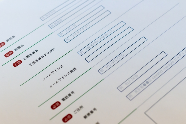
Interestingly, modern forms seem to have more input fields. When we mentioned this to an overseas client, they asked for examples of Japanese forms with fewer input fields. So, we examined over 100 forms and found that most had at least four fields, averaging around 10. Some had extensive questionnaires with up to 20 fields. My assistant spent about 30 minutes searching and couldn’t find a single form with three or fewer fields. We also read similar observations on a fellow professional’s blog, confirming this trend.
Why is this happening?
Is it because people have grown accustomed to the internet and find inputting a lot of information less burdensome? Or maybe it’s due to faster internet speeds? Could businesses be requesting more detailed information? Or perhaps web development firms haven’t given much thought to simplifying forms?
Could it be that longer forms are intentionally designed to deter prank submissions and spam? But if so, there must be alternative methods to achieve that goal.
It remains a mystery.